Tag: logo
-

NCMA
Newport City Martial ArtsA rebrand that packed a punch, but was grounded in values of pride, teamwork and belonging. Colour was the champion here. Orange hues were inspired by Zen Buddhism and drew on the symbolism of the orange belt itself: growing strength, plus the colour’s psychology of warmth, social, welcoming and happiness. For the black and white…
-

FSEW
International Freight CompanyA big brand with big trucks was just the beginning of my collaboration with FSEW. Reliability, speed and trust were the foundations of their values. Values which I matched in my approach to the project. Land, air or sea, this worldwide haulage brand continues to deliver.
-
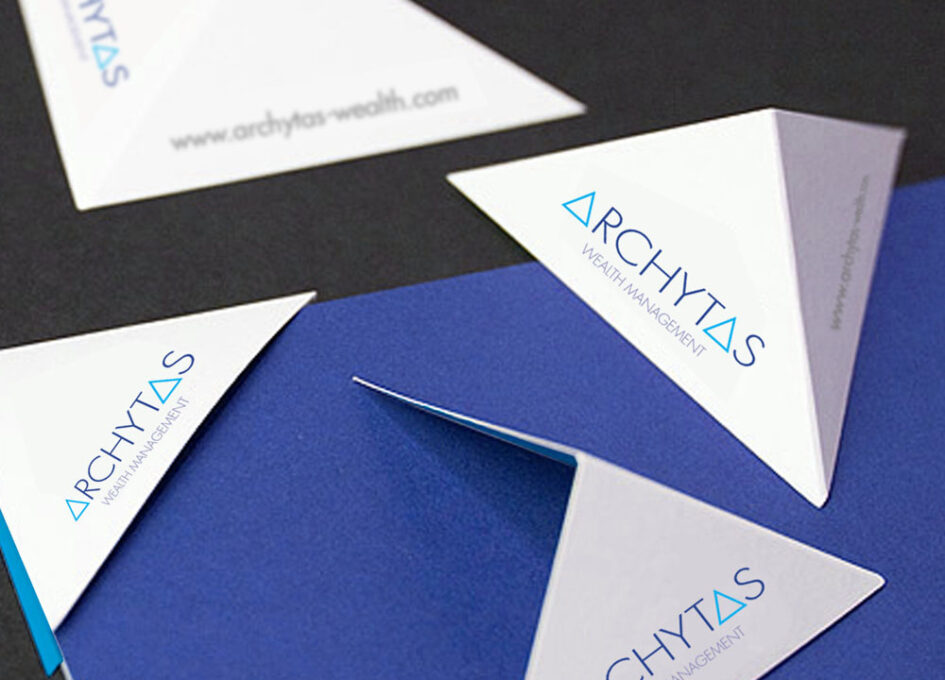
Archytas
Financial Investment CompanyAs wealth managers, Archytas knew a thing or two about numbers. They loved formulas too, so Pythagoras and the triangular form became a starting point from which to develop the brand identity – with clear Greek influences carried through in the art direction. Add to that the laurel wreath, a lead typeface that nodded to…
-

Significant Ceremonies
Celebrant ServiceA brand for a well-respected celebrant, Janet Celia — a trusted wordsmith and brilliant speaker who delivers services for births, weddings and funerals. This called for a consistent visual direction that showed empathy and understanding for each offering, leading with a soft blanched image of a layered white peony alongside classic typography. Compassionate, considered design.…
-

PMB
Performance Masterbatches Colour MatchingThe plastics colour-matching industry is a global business that demands the highest attention to detail. So when developing this brand, it was imperative that right from day one everything was 100% consistent. Not just bang on-brand, but spot-on colour.
-
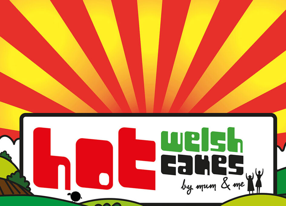
Hot Welsh Cakes
Food businessA start-up close to both my heart and my stomach. Behind the business is the cheery mother/daughter duo — the secret ingredient that injected personality and flavour to the branding, enticing hungry customers with a piping hot bilingual logo from the green, green grass of home.