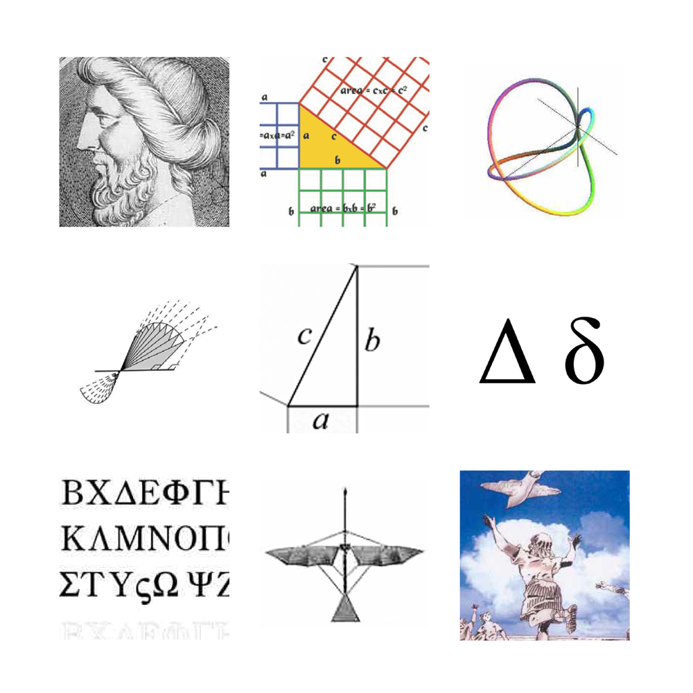
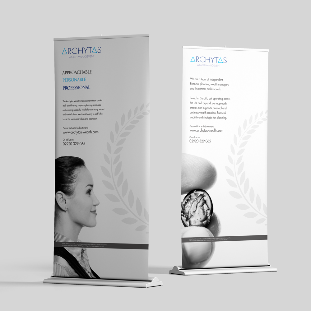
As wealth managers, Archytas knew a thing or two about numbers. They loved formulas too, so
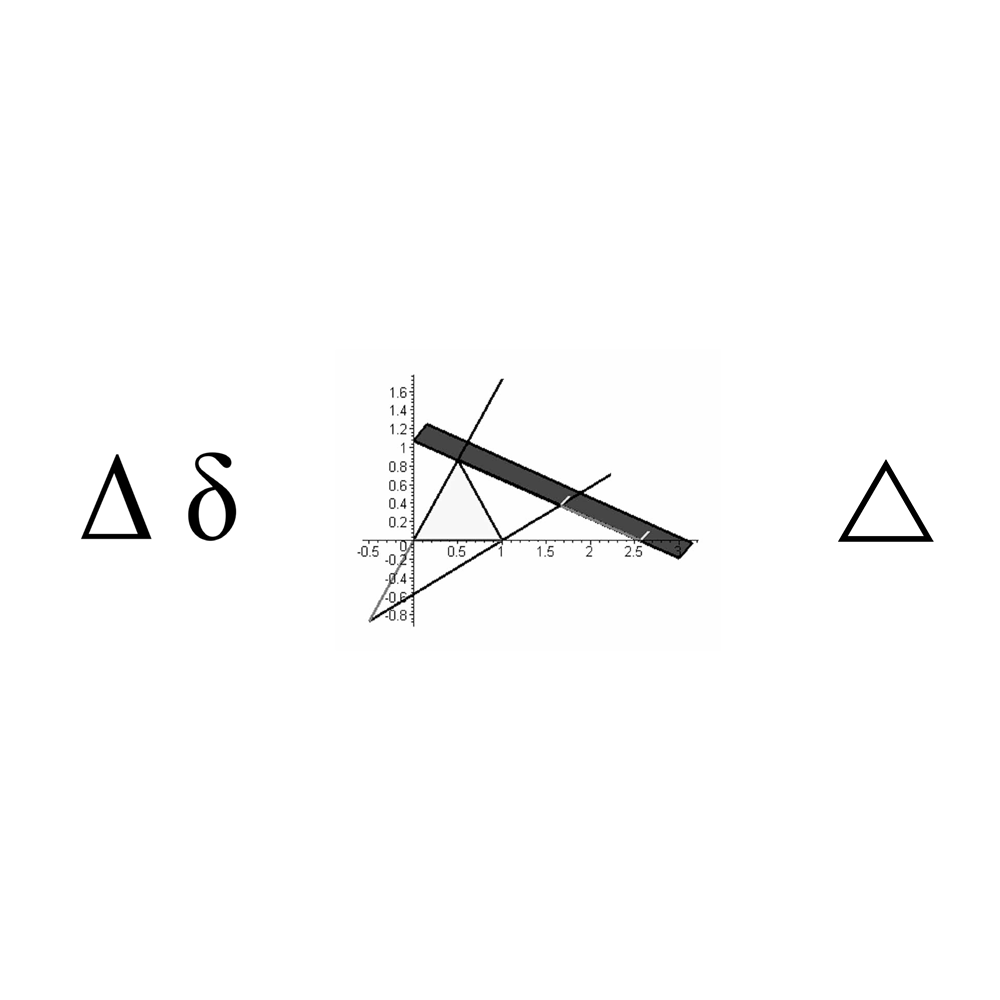
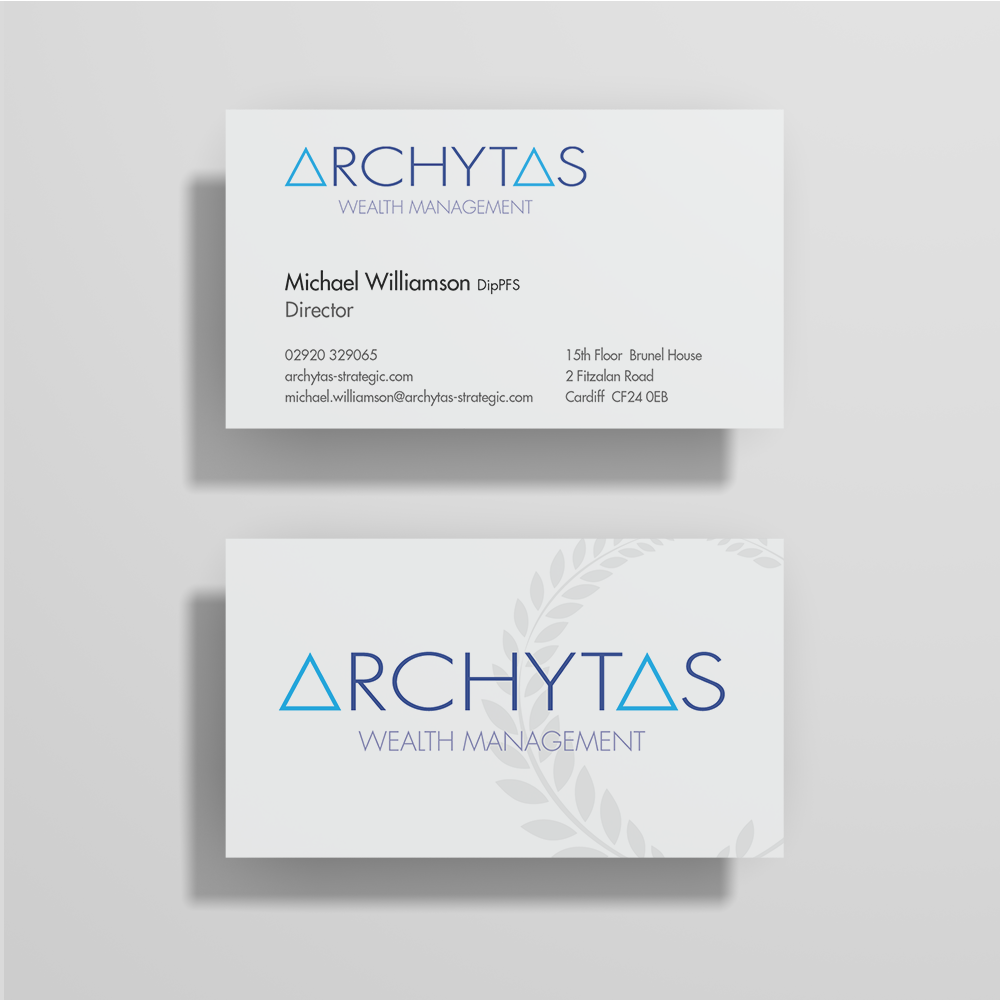
Pythagoras and the triangular form became a starting point from which to develop the brand identity –
with clear Greek influences carried through in the art direction.
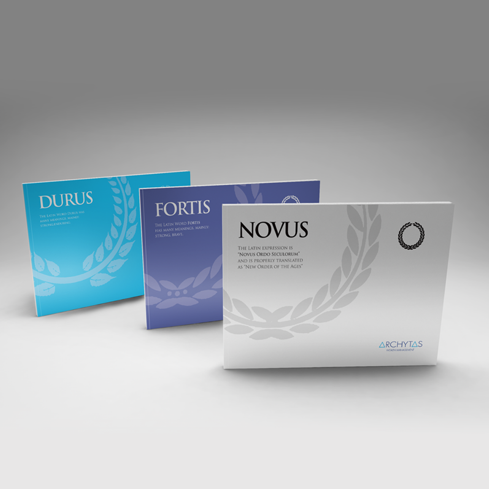
Add to that the laurel wreath, a lead typeface that nodded to Roman inscriptions and a clean, corporate
palette, and Archytas was transformed into a brand that was right on the money (and fit for the Greek
Gods).
